

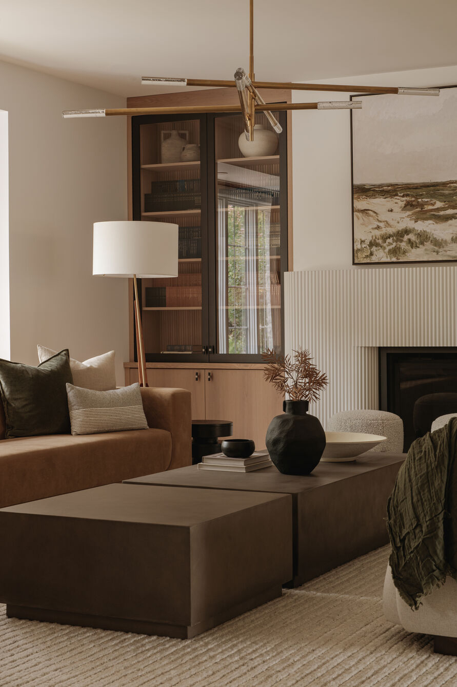
Interior design is much more than making a room look pretty. As with any art form, there’s a science to it. Interior designers are masters of optimizing indoor environments so they are safe, functional, and visually appealing while matching the client’s lifestyle.
As the seasons change here in Canada, so does the intent of interior design. Autumn decor aims to draw people indoors as the outside world gets darker and cooler — so it’s no coincidence that looking at a plush, burnt orange cushion feels almost as comforting as sipping hot cocoa.
Lisa Kooistra, Principal Designer and Founder of LK Designs, explains that spring and summer decor is about opening up, with lighter palettes and airier fabrics. Winter, especially post-holidays, tends to go the other way and gets starker and more minimal, as a sort of visual reset. “Autumn sits in between,” she says, “and its job is really to ease that transition.”
The joy of nesting
Making home an inviting refuge from the elements doesn’t require a major overhaul. Karin Bennett, Principal Designer, Karin Bennett Designs, says the current trend is more about creating a home that feels warm and collected year round, and then introducing subtle seasonal changes through textiles, throws, pillows, artwork and accessories. Bringing in warmer tones, or simply switching to warmer-hued lightbulbs and bringing in more lamplight and candles, can soften the ambiance and have a big impact on how a room feels.
“Our brains naturally make associations with visual and tactile cues based on our experiences and memories,” Bennett says. “While the response is personal and influenced by individual experiences, colour and texture can create very real psychological associations.”
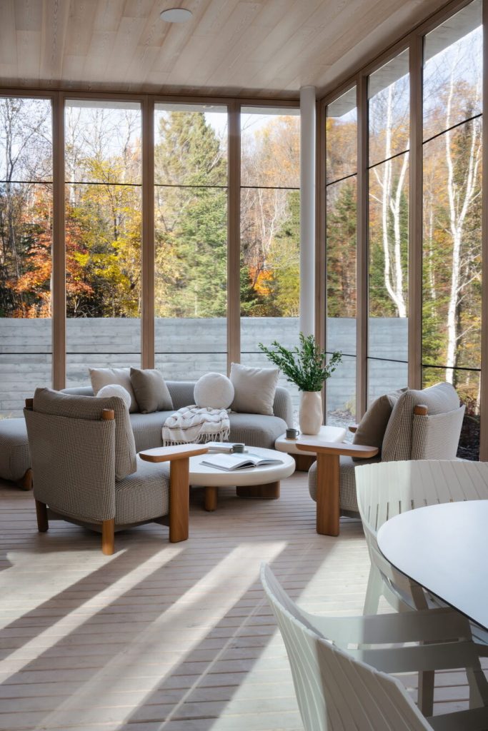
Creating an inviting, intimate space calls for homey accents and layered, lived-in aesthetics. This season, our local interior designers are seeing a theme of warmth in various forms:
- Warm-toned wood finishes
- Texture over pattern: bouclé, heavy wool, nubby linens
- A colour palette of deep terracottas, mossy greens, warm neutrals like taupe, caramel and clay
- Metals shifting warmer: unlacquered brass and aged bronze replacing cool chrome and nickel
- Natural and living finishes: raw wood, stone, a bit of greenery
- Jewel tone accents (deep burgundy, forest green) paired with warm neutrals for a grounded look
Mindful decor
Tastes of the day evolve with the times, but the principles of design hold true, working their magic in our collective subconscious.
“Warm colours like gold, rust, and deep red are linked in our brains to fire, sunlight, and autumn’s natural tones,” Kooistra explains. “A room done in warm tones feels warmer than one in cool blues and greys, even at the same actual temperature.”
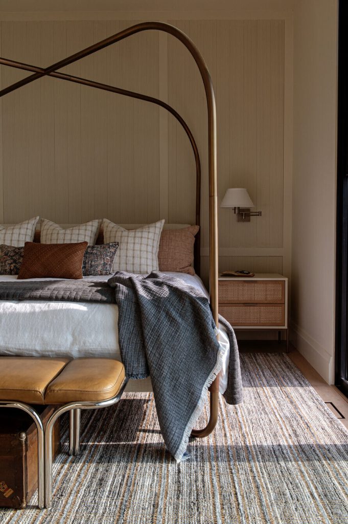
The powerful effect of decor, Kooistra adds, is also due to touch-memory. “Our brains process visual texture partly through the memory of how things feel, so a chunky knit throw or plush cushion reads as soft and warm before you’ve touched it,” she says. “Combining warm colour and texture layers two psychological cues at once: comfort and safety.”
When planning lighting, Bennett often moves toward 2700K, which gives a warmer, softer and more enveloping quality to a space. Clients of her firm also seek comfort in natural materials like wood or stone, as well as woven and multi-textured fabrics. Adding a unique, non-mass produced piece can make a space feel more comfortable and lived in while adding character and a personal touch.
Bennett recently injected some heritage and soul to one of the bedrooms in her home, with the addition of her husband’s nana’s paintings from 1962. The sense of history and personal connection they bring can’t be created with something brand new. “The goal of good interior design,” Bennett says, “is not simply to make a room look beautiful, but to create a feeling.”
By Michelle Morra
Comments are closed.